
Upcoming Design Changes For 2018
Renato Santos & Carolyn Platz
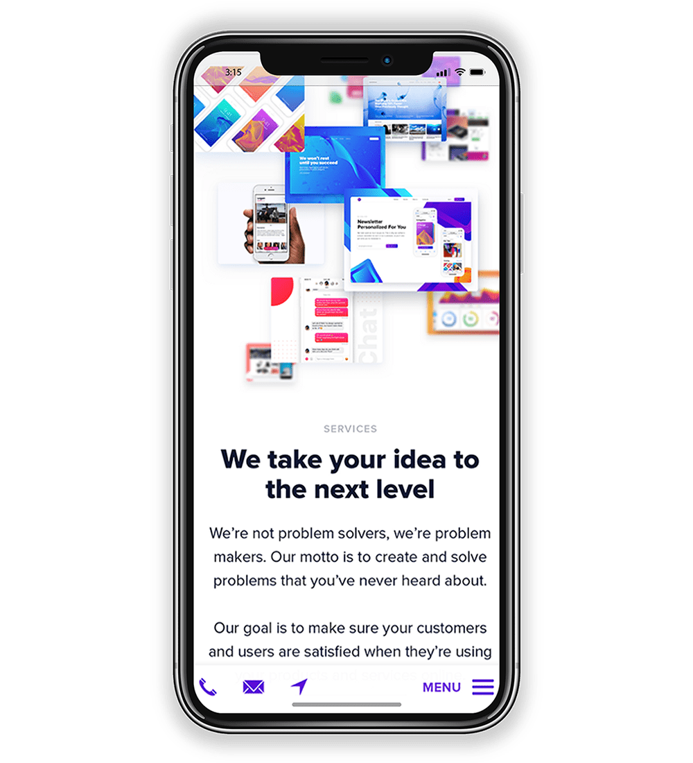
MOBILE IS THE #1 PRIORITY
According to Statista, “In 2016, 43.6 percent of all website traffic worldwide was generated through mobile phones, up from 35.1 percent in the previous year.” It’s true that the importance of mobile-friendly web design has been increasing for the past several years, and that trend doesn’t seem to be slowing down anytime soon.
Google will be rolling out its new Mobile First Index in 2018 and placing more importance on the mobile version of your website by making it the first to be seen in the search results. This means that your website must have a mobile-friendly design, otherwise, you’ll feel a tremendous decline in your site result ranking.
IRREGULAR GRID LAYOUTS
Grid layouts provide an easy way for designers to tie all of the elements of their pages together, giving each page a theme and making it easier to navigate. This design theory has been around forever, but there’s been a shift in the way they’re being used.
2017 we saw many new websites being developed using asymmetrical layouts in order to break the “monotony” we’ve been accustom to. This shift toward designers using more neutral space and more irregular grid layouts for an ultra-modern design style is extremely welcome.
Simple styles that include the use of whitespace (or negative space) makes content stand out so that it’s easier to read and navigate. These styles are also easier on the eyes, encouraging users to spend more time on your site.
”People typically only spend a few seconds, up to a couple of minutes, looking at your pages, so you need to catch their attention right away with colors and designs that stand out."
BOLD FONTS & Bright Colors
To complement these modern design styles, you’ll need type font that stands out, and big bold font styles are the way to go. They also have the upside to help users focus on your content, while the whitespace makes it easier to read and skim through.
People typically only spend a few seconds, up to a couple of minutes, looking at your pages, so you need to catch their attention right away with colors and designs that stand out. The goal is to create an easy and enjoyable experience for the user to keep them on your site for as long as possible, and eventually convert them into paying customers.
In 2018, we may also see these fonts and colors taking the place of images, making a distinctive sense for mobile mainly. Unlike images, which slow pages down, scaling the size of your typography won’t impact performance. It also creates cleaner lines on your page that help your calls-to-action pop. Large buttons, hero images, and clickable images are going out of style and making way for large typographic expressions.